Elements of Floral Design

In our previous blog we spoke about Principles of Floral Design.
Today we conclude the chapter with Elements of Floral design.
ELEMENTS OF FLORAL DESIGN
In floristry our designs determine how we choose our materials.
Elements of Floral design allow freedom and flexibility to be expressed in your own floral style.
Following some simple rules of Elements of Design, this blog will help and guide you to create a visual impact and statement to your next Floral Installation.
“The designer does not begin with some preconceived idea.
Rather, the idea is the result of careful study and observation, and the design a product of that idea.”

Elements of floral design are:
· Colour
· Form
· Space
· Texture
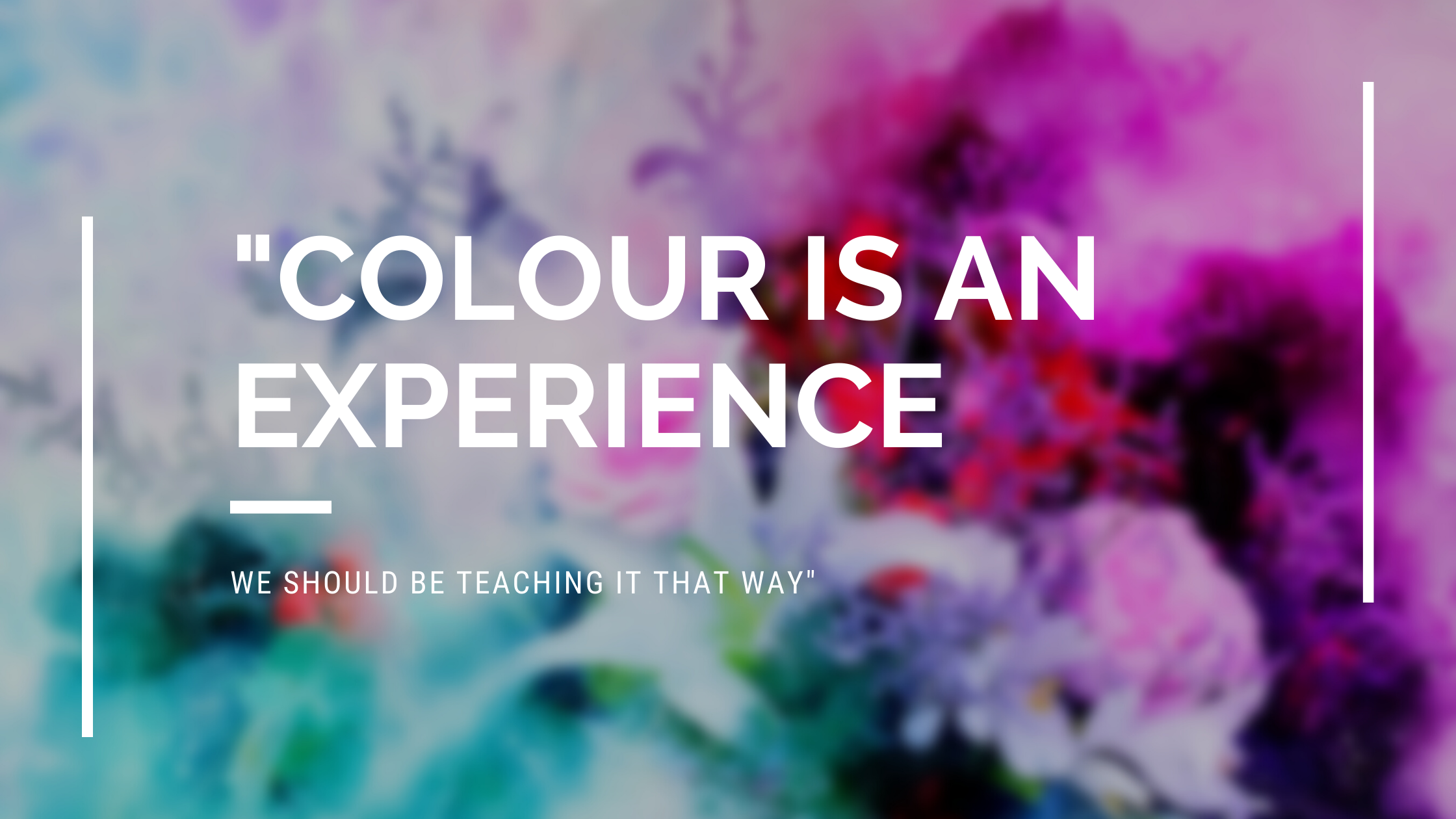
COLOUR
With colour you can express your emotions, negative or positive.
This is why it is extremely important to know how to use the colours correctly within your design.
Container, materials, and flowers must be colour coordinated precisely.

The colour wheel has many colour groups, but three most used basic groups are:
PRIMARY COLOURS
Red, Blue and Yellow.
These colours cannot be created by mixing the colours and they are the source of all colours.
SECONDARY COLOURS
Green, Orange and Violet can be created when mixing two primary colours that are next to each other on the colour wheel equally.
TERTIARY COLOURS
Can be achieved when mixing equal part of primary colour and a secondary colour that lies next to it.
“colour must fit together as pieces in a puzzle or cogs in a wheel.”

“TO LIVE THE CREATIVE LIFE,WE MUST LOSE OUR FEAR OF BEING WRONG.”
There are three dimensions of colour.
· HUE (the name of the colour)
· CHROMA (saturation of the colour)
· VALUE (darkness or lightness of the colour
Colour value can also change by tints, shades and tones.
Tints -is when white is added into a colour
Shades - is when black is added to a colour
Tones -when grey is added to a colour
We divide the colours in three major types: Complementary , Analogous and Monochromatic colours
COMPLEMENTARY COLOURS
Are warm and cool colours that lay opposite to each other on the colour wheel.
The complementary colour harmony gives the greatest contrast, due to colours opposing.
This is why designing with them creates the greater impact with less flowers.
For example; blue-orange, violet-yellow, red-green.
Contrast can always be heightened all you need to do is, intensify the colour you choose.
It is highly recommended to use them in the arrangements used in large halls and reception venues.
Avoid using them in smaller areas.
“SIMPLICITY CARRIED TO AN EXTREME,BECOMES ELEGANCE”
Complementary colours are usually divided in advancing (warm hues-reds, yellows, oranges, red-violet, and yellow-green) or receding (cool hues-blues, greens, blue-violet and violets).
As a florist you must think about the colour of your design and what is the intention of your design.
People can get emotionally affected by the colours so choosing the correct colour is vital.
For example; if you wish to cheer someone you use warm colours and for more formal occasions you choose cooler colours.
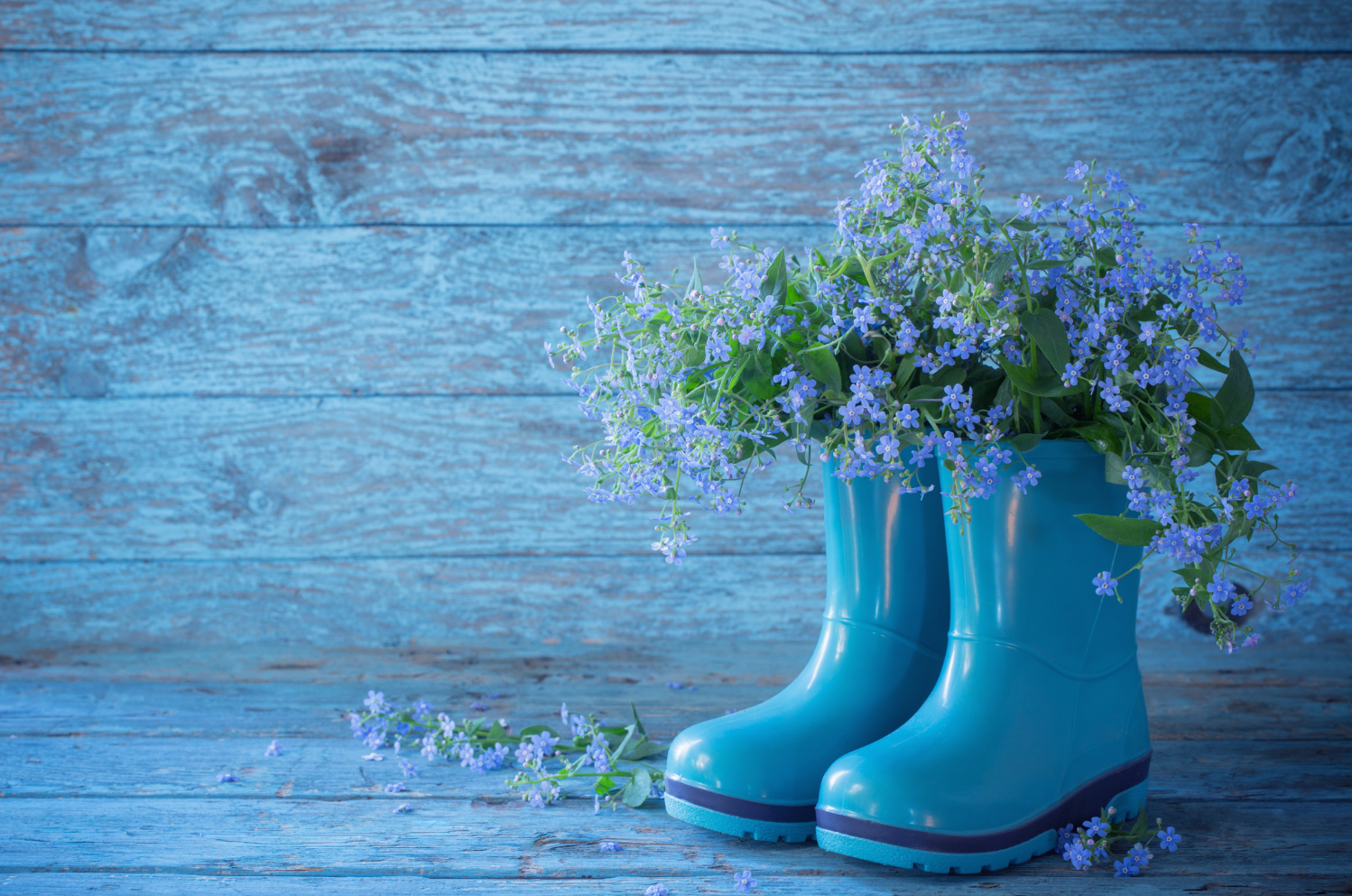
ANALOGOUS COLOURS

Are the colours that lay next to each other on the colour wheel.
Such as blue, blue-green and green.
This blue-green mix should be well balanced between colours.
Analogue colours consist of one primary, one secondary and two intermediate colours.
Using them you can create comfortable, natural, flowing look of the design.
Due to analogous harmony emotional feel you choose either the cool side or the warm side of the harmony.
Examples when creating:
AUTUMN FEEL (yellows, oranges, browns)
SUNSET FEEL(red-violets, violets)
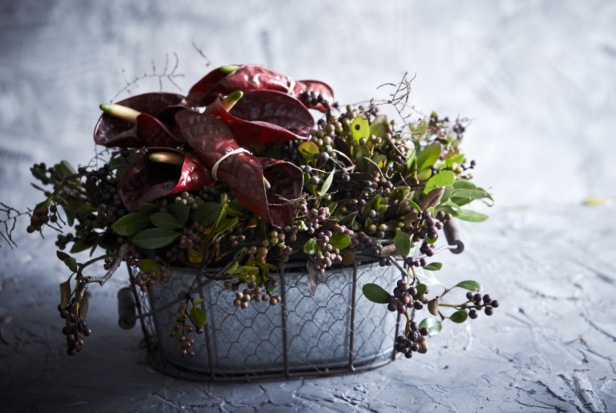
MONOCHROMATIC COLOURS
Monochromatic colour scheme is based on only one single colour and its varieties of tints, shades and tones.
Basically, when one base colour is chosen we use saturation and brightness of this colour to make lighter and darker versions of it.

TERTIARY COLOURS
Are a mixture of equal part of one primary and one, two or more secondary colours.
Tertiary colours on the colour wheel are:
RED+VIOLET=RED-VIOLET
RED+ORANGE=RED-ORANGE
BLUE+GREEN=BLUE-GREEN
BLUE+VIOLET=BLUE-VIOLET
YELLOW+ORANGE=YELLOW-ORANGE
YELLOW+GREEN=YELLOW-GREEN

FORM
Form is the shape of the arrangement that includes depth, height and width.
We divide form into two parts.
One part deals with the shape of the arrangement and the second part with shape of an object. (flowers, foliage)
A symmetrical bowl arrangement is called a ‘Form’ Arrangement.
All traditional designs become ‘Form’ Arrangements as we are restricting them to fit into a predetermined shape.
We can divide form in flower/plant material into three shapes.
· ROUNDS/POINTS
· LINES
· IN-BETWEENS

ROUNDS
As a florist you use rounds-points in flower material to create the passive area in your design as these forms have very low impact.
LINES
Flower material with lines may be thin, straight, towering, bending.
Their form has a great impact and we should place them in active areas where they can be appreciated.
IN-BETWEENS
Flower material in this category is usually used to connect/link active and passive areas and create a transitional smooth area.
SPACE
Space is divided into two parts.
· AREA SPACE ( Where design is meant to be displayed)
It is very important to know where the arrangement will be displayed.
(walls, windows, curtains, floors, light…)
If it is not possible to visit the area make sure to ask your clients to send as many photos or videos, so you can visualize the setting and create the appropriate design.
· FLOWER SPACE ( The space around each flower material)
Try to define the maximum space within the design.
This way, you will know which flowers to use and how to use them.
Every flower needs it’s own space and identity.
“A flower does not think of competing to the flower next to it.
It just blooms.”
TEXTURE
Texture can be described as the feel, appearance or characteristics of the surface.
Every single thing in our environment that surround us, has a texture. (rough or smooth).
For example printing paper (smooth), sand paper (rough).
In Floral Design Texture should vary, especially when creating single colour design.
Although there are some flowers that feel soft, when touched, but appearance of it, is rough.
Great example of so called visual texture are Dahlias. (soft on the touch, rough when looked at.
A Florist should always focus and understand how to correctly apply Visual Texture in floral design.

Come along and take a peek of a some of my online courses down bellow